The new pictogram gives off very few feelings of “hospital” though.
Back in July, RocketNews24 shared an article about how Japan will be updating its onsen symbol because the old one confused foreigners into thinking there was a “hot food restaurant” as opposed to a “hot spring location”. Mishaps like this are situations that a country should be trying to avoid as they prepare to welcome a host of foreigners for the Olympics in 2020. The Ministry of Economy, Trade and Industry and the Foundation for Promoting Personal Mobility and Ecological Transportation have been attempting to transform public pictograms into widely recognizable symbols that everyone can understand, no matter what language they speak. While many Japanese people were vocal about their opposition to changing the original symbol, many understood the point.
With a somewhat successful campaign under their belt, the pictogram team released their newly designed symbol for a hospital. Well, they may want to go back to the drawing board as this one isn’t being well received either.
病院から遺体安置所に変わったようにしか見えぬ pic.twitter.com/gnDjewaevu
— ワダツミ (@WadatumiG) October 6, 2016
The most immediate concern is that the pictogram looks nothing like a hospital or a place where one can receive medical care. Instead, it appears to be a guy lying in his deathbed under a cross or a place where corpses are enshrined. We can’t say for certain that this new symbol gives off the right impression. Other Japanese users poked fun at the proposed mark saying that it looked like their grandpa or that the men was about to be skewered by a cross from above.
While the cross in a building is one of the most recognizable symbols for a hospital worldwide, it isn’t the only one, so coming up with a new symbol to represent a hospital isn’t that odd. The general consensus though, is that whatever symbol is eventually chosen, it should be clean, simple and not open to misinterpretation.
Source: Hamsoku
Featured image: Twitter/@WadatumiG
 LoCoS: The universal language we’ll be using by 2065, according to legendary Japanese designer
 Stylish new Experience Japan Pictograms are here to enhance your Japan travels and knowledge
 Japanese government recommends changing Buddhist temple mark on maps to avoid Nazi connotations
 Japan’s government reconsiders plan to change country’s iconic hot spring symbol after backlash
 Japan to add first new symbol to maps in 13 years, can you guess what it means?
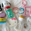 McDonald’s new Happy Meals offer up cute and practical Sanrio lifestyle goods
 All-you-can-drink Starbucks and amazing views part of Tokyo’s new 170 meter-high sky lounge
 Super Nintendo World expansion gets delayed for several months at Universal Studios Japan
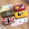 Studio Ghibli glasses cases let anime characters keep an eye on your spectacles
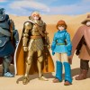 Studio Ghibli releases new action figures featuring Nausicaä of the Valley of the Wind characters
 Kyoto’s 100 Demons yokai monster parade returns!
 We try out “Chan Ramen”, an underground type of ramen popular in the ramen community
 Japanese sangria is the most refreshing drink you’ll have all week【Recipe】
 We put the internet’s “techniques for emptying your bladder with morning wood” to the test
 Find a red envelope on the ground? Here’s why you should never pick it up
 More foreign tourists than ever before in history visited Japan last month
 Disney princesses get official manga makeovers for Manga Princess Cafe opening in Tokyo
 Starbucks reopens at Shibuya Scramble Crossing with new look and design concept
 Beautiful new Final Fantasy T-shirt collection on the way from Uniqlo【Photos】
 Is the new Shinkansen Train Desk ticket worth it?
 Foreign English teachers in Japan pick their favorite Japanese-language phrases【Survey】
 Beautiful Sailor Moon manhole cover coasters being given out for free by Tokyo tourist center
 Studio Ghibli releases Kiki’s Delivery Service chocolate cake pouches in Japan
 Japan’s bone-breaking and record-breaking roller coaster is permanently shutting down
 New definition of “Japanese whiskey” goes into effect to prevent fakes from fooling overseas buyers
 Our Japanese reporter visits Costco in the U.S., finds super American and very Japanese things
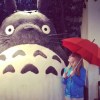
 Studio Ghibli unveils Mother’s Day gift set that captures the love in My Neighbour Totoro
 Domino’s Japan now sells…pizza ears?
 New Japanese KitKat flavour stars Sanrio characters, including Hello Kitty
 One of Tokyo’s most famous meeting-spot landmarks is closing for good
 Kyoto creates new for-tourist buses to address overtourism with higher prices, faster rides
 Sales of Japan’s most convenient train ticket/shopping payment cards suspended indefinitely
 Sold-out Studio Ghibli desktop humidifiers are back so Totoro can help you through the dry season
 Japanese government to make first change to romanization spelling rules since the 1950s
 Ghibli founders Toshio Suzuki and Hayao Miyazaki contribute to Japanese whisky Totoro label design
 Doraemon found buried at sea as scene from 1993 anime becomes real life【Photos】
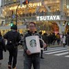 Tokyo’s most famous Starbucks is closed
 One Piece characters’ nationalities revealed, but fans have mixed opinions
 We asked a Uniqlo employee what four things we should buy and their suggestions didn’t disappoint
 Princesses, fruits, and blacksmiths: Study reveals the 30 most unusual family names in Japan
 Kobe hospital gets anonymous 5 million yen cash donation, gives it back, gets it again, keeps it
 Osaka’s Hotel Games isn’t just full of board games, it is a game!
 Our Japanese language reporter gets lucky with Vietnam McDonald’s Prosperity Beef Burger
 Tokyo couple caught making stickers with police mascot flipping bird
 Japan’ deadliest New Year’s food may be even more dangerous in 2021 due to the coronavirus
 6 surprising things about having a baby in Japan
 Japanese toilets become even more high-tech with new floating panels
 How to get free healthcare in Japan without insurance
 Japan’s onsen amusement park begins crowdfunding campaign with awesome returns for investors
 The blood-soaked meaning behind the mysterious marks on the floor at Tokyo Station【Photos】
 Korean Officials to foreign tourists: “If you contract MERS, we’ll give you $3,000!”
 Junior high student leaves us laughing after mistaking traditional pattern for Wi-Fi symbol
 Sports car or fighter plane? American tuner’s Nissan GT-R looks like World War II’s Zero
 Tokyo’s latest plan to boost birth rate: Pay people 100,000 yen per baby they give birth to
 Japan’s 10 favorite emoji for Twitter, and how they compare to the rest of the world
 2020 Miss Yukata Japan beauties in traditional Japanese garb debut at Ikaho Onsen 【Video】
Leave a Reply