

On March 11, an unprecedentedly large earthquake struck northern Japan, marking 2011 as a disastrous year for the Japanese. This video shows the fierce power of that quake and the cascade of aftershocks that came in the months to follow as nothing less than horrific.
Titled “Japan Earthquakes 2011 Visualization Map,” the video presents the distribution and severity of all the earthquakes that occurred in Japan with a very easy to understand system of circles and a graph. One can easily see the extent of trauma Japan experienced.
When March 11 rolls around in the video, suddenly Japan is struck by a shocking number of intense earthquakes, one after another without respite. To be honest, I was surprised that so many earthquakes could occur at the same time.
Or rather, to look at it from a different point of view, the video made me realize I had grown so accustomed to living through repeated earthquakes that I had lost some sense of their destructive power. There is also a similar video which shows earthquake on a global scale. Watching that, I was again impressed by Japan’s strength in enduring such an overwhelming amount of seismic activity.
It’s such an impressive visualization, I hope everyone will check it out. By the way, that yellow line that starts in the bottom left of the screen is the total number of earthquakes over time. It clearly shows how the occurrence of earthquakes became much more frequent.
This video shows the visualization for Japan.
This video shows the global one.
[ Read in Japanese ]
 Osaka earthquake: Scenes show damage from strongest tremor to hit the region in decades
 Is Japan about to be rocked by a big earthquake?
 Continuing earthquakes in Kumamoto have moved a GPS observation station nearly one meter
 M6.3 earthquake hits Japan, anime fans rush to tweet photos of damage to figure collections
 Beautiful new Final Fantasy T-shirt collection on the way from Uniqlo【Photos】
 Disney princesses get official manga makeovers for Manga Princess Cafe opening in Tokyo
 Foreign English teachers in Japan pick their favorite Japanese-language phrases【Survey】
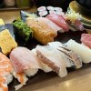 Randomly running into a great sushi lunch like this is one of the best things about eating in Tokyo
 Osaka’s creepy cute mascot speaks for first time, adds more fuel the creepy OR cute debate【Video】
 Our reporter takes her 71-year-old mother to a visual kei concert for the first time
 Cosplay indoors with new range of Taisho Roman schoolgirl costumes from Japan
 A new meaty dawn for Akihabara as neighborhood’s best steak/hamburger steak restaurant reopens
 Mochi, the silent New Year killer, leaves nine dead and 128 hospitalized
 Hey, Japanese taxi driver! Take us to your favorite restaurant in Tsuruga City!
 We try out “Chan Ramen”, an underground type of ramen popular in the ramen community
 New Studio Ghibli bedding sets are cool in all senses of the word
 Our Japanese reporter visits Costco in the U.S., finds super American and very Japanese things
 New Pokémon cakes let you eat your way through Pikachu and all the Eevee evolutions
 There’s a park inside Japan where you can also see Japan inside the park
 Japanese convenience store packs a whole bento into an onigiri rice ball
 Hanton rice — a delicious regional food even most Japanese people don’t know about, but more should
 Final Fantasy, Kingdom Hearts, and Dragon Quest pet product line announced by Square Enix
 Studio Ghibli releases Kiki’s Delivery Service chocolate cake pouches in Japan
 Japan’s bone-breaking and record-breaking roller coaster is permanently shutting down
 New definition of “Japanese whiskey” goes into effect to prevent fakes from fooling overseas buyers
 Foreign passenger shoves conductor on one of the last full runs for Japan’s Thunderbird train
 Kyoto bans tourists from geisha alleys in Gion, with fines for those who don’t follow rules
 Studio Ghibli unveils Mother’s Day gift set that captures the love in My Neighbour Totoro
 Domino’s Japan now sells…pizza ears?
 Toyota built a life-sized Miraidon Pokémon and are letting people test drive it this weekend
 New Japanese KitKat flavour stars Sanrio characters, including Hello Kitty
 Sales of Japan’s most convenient train ticket/shopping payment cards suspended indefinitely
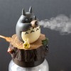 Sold-out Studio Ghibli desktop humidifiers are back so Totoro can help you through the dry season
 Japanese government to make first change to romanization spelling rules since the 1950s
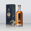 Ghibli founders Toshio Suzuki and Hayao Miyazaki contribute to Japanese whisky Totoro label design
 Doraemon found buried at sea as scene from 1993 anime becomes real life【Photos】
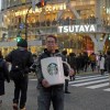 Tokyo’s most famous Starbucks is closed
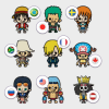 One Piece characters’ nationalities revealed, but fans have mixed opinions
 We asked a Uniqlo employee what four things we should buy and their suggestions didn’t disappoint
 Princesses, fruits, and blacksmiths: Study reveals the 30 most unusual family names in Japan
 Studio Ghibli’s new desktop Howl’s Moving Castle will take your stationery on an adventure
 Edo-era illustrated records show the disasters that have plagued Japan throughout its history
 National Film Archive of Japan releases shocking historical videos of 1923 Great Kanto Earthquake
 Japan makes card game to help kids raise disaster prevention awareness
 Strong earthquake hits Hokkaido in Japan, dozens missing and injured
 Tokyo Tower displays special message ahead of Tohoku earthquake and tsunami anniversary
 97 percent of Kumamoto convenience stores open for business just three days after major quakes
 M5.6 earthquake in Tokyo brings some weird photos to Twitter
 Messages of support from Taiwan warm the hearts of Kumamoto earthquake victims
 Annual Tokyo memorial for March 11 tsunami comes with a heartwarming musical surprise【Video】
 As earthquakes rock the region, Kyushu Shinkansen commercial is more poignant than ever【Video】
 Japanese teachers confiscate students’ cell phones following Osaka earthquake, get slammed online
 Pokémon GO enters partnership to help disaster-stricken regions of Japan 【Video】
 Two of Japan’s biggest chains travel to disaster-stricken Kumamoto to hand out free beef bowls
 Limited Hayao Miyazaki figurines created for Tsunami Relief
Leave a Reply