
Despite the best efforts of Microsoft and RIM, it seems that most of the world’s smartphone markets are largely divided into iPhone and Android users. As iteration after iteration of the latest and shiniest devices appear on our shelves, the debate over which is best grows ever more intense. While it would be impossible to pick a definitive winner in the smartphone race, we could go a long way to figuring it out by looking at how many users each system has attracted.
Enter Gnip, an IT company from the US that specializes in social media, and their beautiful, firework-like, Twitter maps!
- Mobile handset distribution maps
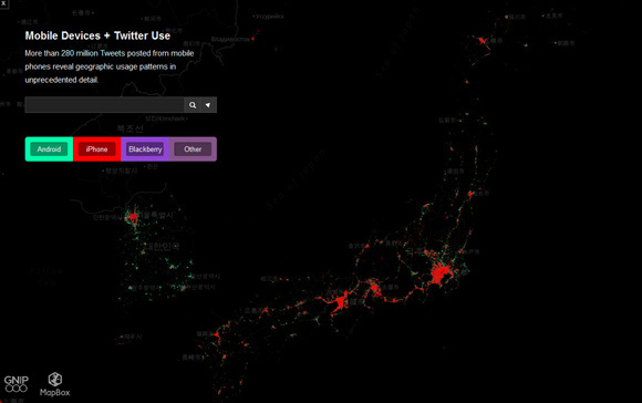
Gnip has created a global distribution map of smartphone handsets using Tweets!
See? Twitter is good for more than just finding out what your favorite celebrity had for breakfast.
Compiling data from over 180,000,000 tweets from mobile users, Gnip is able to get an idea of how many Twitter users have which smartphone. Additionally, the company maintains that they are able to determine where said Twitter users are, giving us a fairly clear image of smartphone distribution.
So, where do you think we’ll find iPhones and Androids in Japan?
- iPhone for the urbanites, Android for the suburbanites
By plotting the data out on a map, with one dot for each tweet, Gnip created a world map showing which phones are used where.
▼Here’s Tokyo.
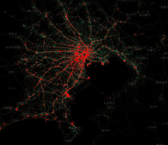
The red dots are for iPhones and the green dots are for Android, with Blackberry, relatively unknown in Japan, in purple. It looks like iPhone users are a bit more concentrated in the city, while Android users are found slightly more in the outskirts and suburbs. This may reflect socio-economic differences, though it’s hard to say. We’re too mesmerized by the pretty colors to think clearly!
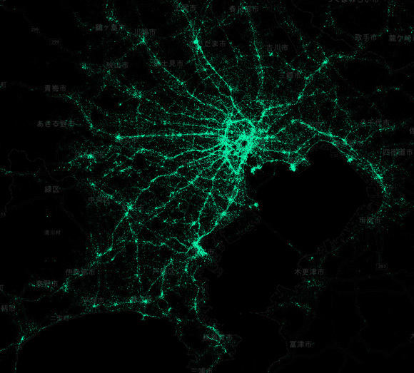
▼Tokyo, Android only
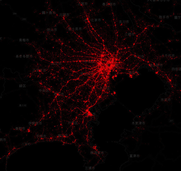
▼Tokyo, iPhone only
- Blackberry makes an appearance!
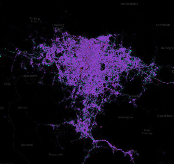
Despite what many might think, Blackberry isn’t completely out of this fight yet! In some Asian countries, such as Thailand, Singapore, and the Phillipines, Blackberry shows up a bit more clearly. In fact, Blackberry dominates the competition in Jakarta.
▼Jakarta, Land of Blackberry!
And in some European countries, such as the UK, Spain and France, it looks like Blackberry is still pretty popular.
- A few words of caution
As interesting as this data is, there are a few issues that make it difficult to take at face value. The first issue is that Twitter location information was used to compile these maps. That means that people who have location sharing turned off might not show up, which could severely skew the results.
Also, not everyone uses Twitter, as shocking as it may seem. Still, the maps help us get a better idea of the current landscape of smartphones. And they’re super pretty too!
You can check out and play around with the maps on MapBox.
We’ll leave you with a few more maps from around the globe. Man, they sure would look great under a black light in a college dorm room, wouldn’t they?
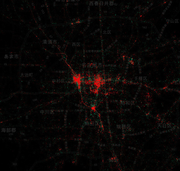
▼Nagoya
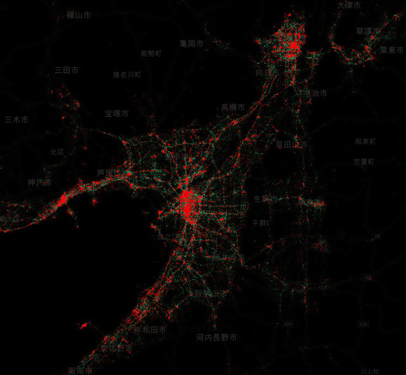
▼Osaka and Kyoto
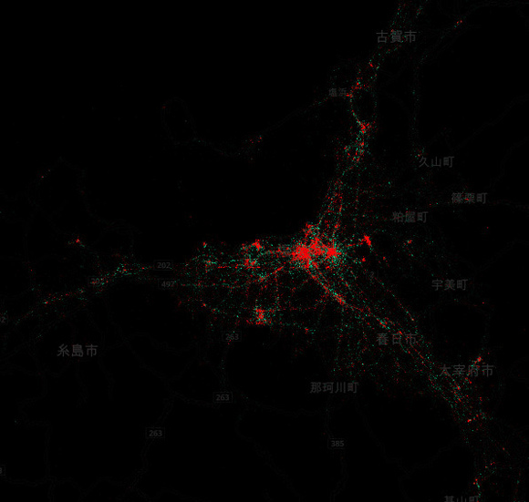
▼Hakata (in Fukuoaka City, Kyushu)
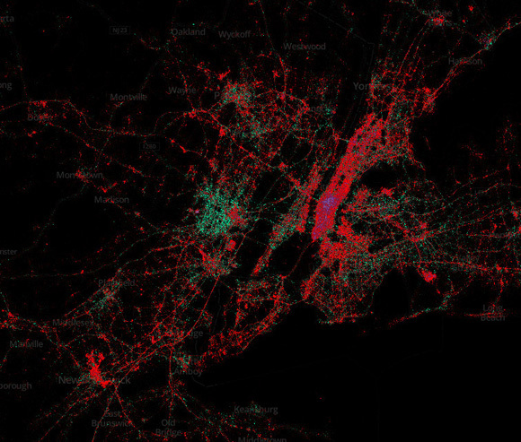
▼New York (Look at that nest of Blackberries!)
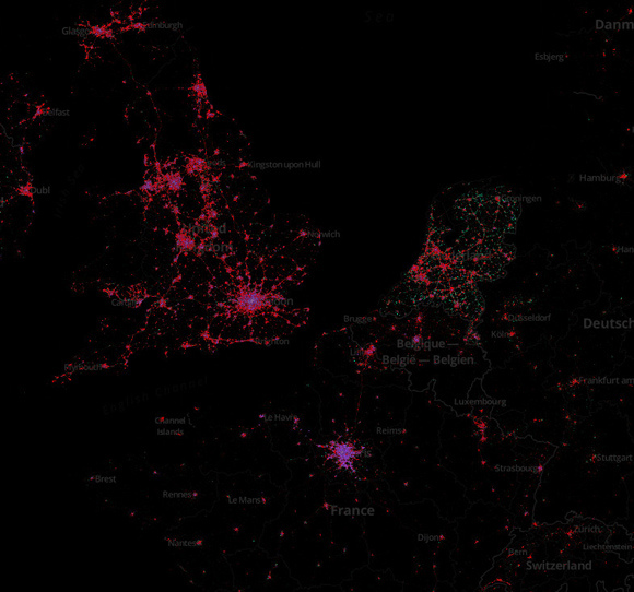
▼The UK, France, Belgium, and Holland
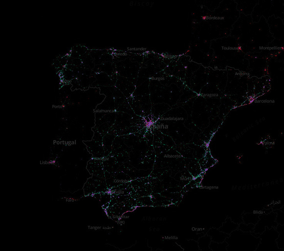
▼Spain and Portugal
[ Read in Japanese ]
 Hidden smartphone feature reveals a strange Japanese emoticon
 One of the biggest smartphone makers in China just released this blatant iPhone 6 clone
 Why is the iPhone the smartphone of choice for young Japanese women?
 Your iPhone is embarrassingly bad at simple math
 Smartphone app finds empty restroom stalls in Tokyo subway station, makes pooing easier than ever
 McDonald’s new Happy Meals offer up cute and practical Sanrio lifestyle goods
 All-you-can-drink Starbucks and amazing views part of Tokyo’s new 170 meter-high sky lounge
 More foreign tourists than ever before in history visited Japan last month
 Studio Ghibli glasses cases let anime characters keep an eye on your spectacles
 McDonald’s Japan releases a pancake pie for new retro kissaten coffeeshop series
 Beautiful Sailor Moon manhole cover coasters being given out for free by Tokyo tourist center
 Super Nintendo World expansion gets delayed for several months at Universal Studios Japan
 Studio Ghibli releases new action figures featuring Nausicaä of the Valley of the Wind characters
 Starbucks reopens at Shibuya Scramble Crossing with new look and design concept
 Mister Donut ready to make hojicha dreams come true in latest collab with Kyoto tea merchant
 Disney princesses get official manga makeovers for Manga Princess Cafe opening in Tokyo
 Beautiful new Final Fantasy T-shirt collection on the way from Uniqlo【Photos】
 Is the new Shinkansen Train Desk ticket worth it?
 Foreign English teachers in Japan pick their favorite Japanese-language phrases【Survey】
 Japanese convenience store packs a whole bento into an onigiri rice ball
 We try out “Chan Ramen”, an underground type of ramen popular in the ramen community
 Studio Ghibli releases Kiki’s Delivery Service chocolate cake pouches in Japan
 Japan’s bone-breaking and record-breaking roller coaster is permanently shutting down
 New definition of “Japanese whiskey” goes into effect to prevent fakes from fooling overseas buyers
 Our Japanese reporter visits Costco in the U.S., finds super American and very Japanese things
 Studio Ghibli unveils Mother’s Day gift set that captures the love in My Neighbour Totoro
 Foreign passenger shoves conductor on one of the last full runs for Japan’s Thunderbird train
 Domino’s Japan now sells…pizza ears?
 New Japanese KitKat flavour stars Sanrio characters, including Hello Kitty
 Kyoto creates new for-tourist buses to address overtourism with higher prices, faster rides
 Sales of Japan’s most convenient train ticket/shopping payment cards suspended indefinitely
 Sold-out Studio Ghibli desktop humidifiers are back so Totoro can help you through the dry season
 Japanese government to make first change to romanization spelling rules since the 1950s
 Ghibli founders Toshio Suzuki and Hayao Miyazaki contribute to Japanese whisky Totoro label design
 Doraemon found buried at sea as scene from 1993 anime becomes real life【Photos】
 Tokyo’s most famous Starbucks is closed
 One Piece characters’ nationalities revealed, but fans have mixed opinions
 We asked a Uniqlo employee what four things we should buy and their suggestions didn’t disappoint
 Princesses, fruits, and blacksmiths: Study reveals the 30 most unusual family names in Japan
 A better use for your smartphone than Angry Birds: Remotely driving your car!
 What do you call this sitting pose? Japanese netizens polled to find differences in dialect
 Real-time shade information added to walking app from Navitime Japan
 New app lets you traverse the streets of modern Tokyo and ancient Edo at the same time
 Handy portable battery charging service now available in downtown Tokyo for just 108 yen
 East meets West in the Pacific-centered version of the world map
 REVIEW: Samsung’s new fitness gadget makes a sleek smartwatch
 Google kicks off April Fools’ Day with a Google Maps Pokemon Challenge that’s actually real…kinda
 New smartphone game turns your photos of real-world cats into in-game warriors
 South Korean design company turns subway maps into beautiful artwork you can hang on your wall
 Funny case protects your iPhone from falling face down and cracking the screen using Murphy’s Law
 Tokyo’s busiest train stations have a new, free, English-compatible navigation app
 Japanese Twitter has its collective mind blown by “map of Europe” illusion
Leave a Reply