
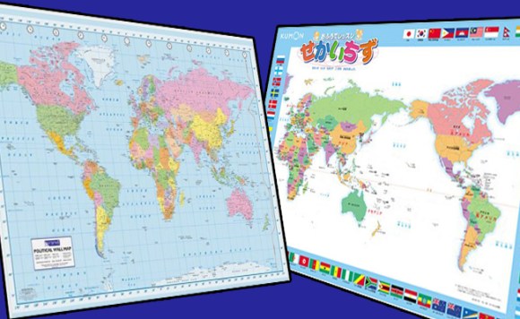
Depending on what part of the world you live in, one of these maps will look right at home while the other might seem kind of off. However, given the overall dominance of the Euro-centric map, the other one is more likely to give an uncomfortable feeling to a greater number of people.
While both are currently in use in different countries, is it possible that one map is more valid than another?
A discussion broke out on the international imageboard 4chan over Pacific-centric maps. Although it was misguidedly introduced as only a “Japanese-made map” surprisingly a fair number of people from various countries came to its defense.
USA: Japanese people use a world map with Japan in the center… What do you think about that?
Canada: Holy crap! Look at all that wasted space in the middle where the Pacific Ocean is.
Italy: It makes more sense than I expected.
France: It “makes sense” that Greenland is split into two?
Finland: Good luck finding anyone who’ll care that Greenland is split.
Argentina: It is useful, putting your own country in the center of the map.
USA: Silly Japanese, don’t they know America is the center of the world?
UK: It’s actually kind of cool. You can better see how homo sapiens evolved and spread across the world from left to right.
Italy: Seeing Italy on the outer parts of the world gives me a strange feeling…
Australia: Australian people use the same map.
Thanks to the comment out of Australia we could see that this map is not exclusive to Japan but to other countries in the Eastern part of Asia as well.
And while we’re on the topic of Australia, I have an open request for the whole continent: Would you please stop telling Japanese tourists that you use a version of the world map with Australia on top? I have met a surprising number of people in Japan who are fully convinced everyone in Australia uses a south-up map.
![]()
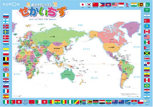
Anyway, the Pacific-centered map certainly has some benefits in terms of anthropology. It also disrupts the barren tundra of Greenland instead of the numerous populated islands of the Pacific. It’s also more in keeping with the tectonic plates.
On the other hand, the Euro/Afro-centric map has the benefit of being more in line with the time zones. In addition, straying from it would screw-up various common English terms. North and South America would become the Far East and the Middle East would become the Mid-West.
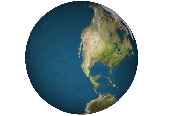
In the end though, it doesn’t really matter as the boundaries of maps are completely arbitrary on a round world. And with the advent of geographic information systems like Google Maps the world can look any way you want it to at any time.
Not to mention that Mercator projection maps are for third-graders and USA Today infographics. If you want a truly distortion-free look at the Earth in 2-D, go Dymaxion map or go home.
Source: Kaigai No Bankoku Hannoki (Japanese)
World Maps: Amazon – 1, 2
South-up map: Wikipedia – CaseyPenk
Dymaxion map: Wikipedia – Chris Rywalt
 Foreign travelers now spend more money in Japan than ever before, surprise country at top of list
 Travel through time with these old maps from the Zenrin Virtual Museum
 The fourth best place to visit in the world is…this neighborhood in Osaka?
 Votes are in! Taiwan chooses its top 5 girls’ school uniforms【Photos】
 South Korean design company turns subway maps into beautiful artwork you can hang on your wall
 McDonald’s new Happy Meals offer up cute and practical Sanrio lifestyle goods
 All-you-can-drink Starbucks and amazing views part of Tokyo’s new 170 meter-high sky lounge
 More foreign tourists than ever before in history visited Japan last month
 Starbucks reopens at Shibuya Scramble Crossing with new look and design concept
 Hamster abandoned at Tokyo ramen restaurant gets new home
 The oldest tunnel in Japan is believed to be haunted, and strange things happen when we go there
 Studio Ghibli glasses cases let anime characters keep an eye on your spectacles
 Beautiful Sailor Moon manhole cover coasters being given out for free by Tokyo tourist center
 Mister Donut ready to make hojicha dreams come true in latest collab with Kyoto tea merchant
 Mr. Sato eats banana flower, still isn’t sure what it tastes like, loves it anyway【SoraKitchen】
 Disney princesses get official manga makeovers for Manga Princess Cafe opening in Tokyo
 We try out “Chan Ramen”, an underground type of ramen popular in the ramen community
 Beautiful new Final Fantasy T-shirt collection on the way from Uniqlo【Photos】
 Foreign English teachers in Japan pick their favorite Japanese-language phrases【Survey】
 Is the new Shinkansen Train Desk ticket worth it?
 There’s a park inside Japan where you can also see Japan inside the park
 Japanese convenience store packs a whole bento into an onigiri rice ball
 Studio Ghibli releases Kiki’s Delivery Service chocolate cake pouches in Japan
 Japan’s bone-breaking and record-breaking roller coaster is permanently shutting down
 New definition of “Japanese whiskey” goes into effect to prevent fakes from fooling overseas buyers
 Foreign passenger shoves conductor on one of the last full runs for Japan’s Thunderbird train
 Our Japanese reporter visits Costco in the U.S., finds super American and very Japanese things
 Kyoto bans tourists from geisha alleys in Gion, with fines for those who don’t follow rules
 Studio Ghibli unveils Mother’s Day gift set that captures the love in My Neighbour Totoro
 Domino’s Japan now sells…pizza ears?
 New Japanese KitKat flavour stars Sanrio characters, including Hello Kitty
 Sales of Japan’s most convenient train ticket/shopping payment cards suspended indefinitely
 Sold-out Studio Ghibli desktop humidifiers are back so Totoro can help you through the dry season
 Japanese government to make first change to romanization spelling rules since the 1950s
 Ghibli founders Toshio Suzuki and Hayao Miyazaki contribute to Japanese whisky Totoro label design
 Doraemon found buried at sea as scene from 1993 anime becomes real life【Photos】
 Tokyo’s most famous Starbucks is closed
 One Piece characters’ nationalities revealed, but fans have mixed opinions
 We asked a Uniqlo employee what four things we should buy and their suggestions didn’t disappoint
 Princesses, fruits, and blacksmiths: Study reveals the 30 most unusual family names in Japan
 Studio Ghibli’s new desktop Howl’s Moving Castle will take your stationery on an adventure
 The Legend of Zelda’s Link is here to help you navigate Google Maps’ dungeons today!
 Japanese government recommends changing Buddhist temple mark on maps to avoid Nazi connotations
 Online “Population Decrease Map” of Japan paints a bleak, womanless future for the country
 JR East putting on love-handles for Valentine’s Day
 Tour alleged yakuza hideouts on Google Maps
 Iwami in Tottori Prefecture is now offering a Free!/High Speed! anime tie-in location map guide
 How safe is Japan? New interactive map reveals reports of crime around the country
 President Trump’s Pearl Harbor comments turn out to be misreported, all of Japan sighs in relief
 New app lets you traverse the streets of modern Tokyo and ancient Edo at the same time
 Hike from the sea to the peak of Mt. Fuji with new bilingual English/Japanese guide map series
 Here it is: The finalized map for Super Nintendo World at Universal Studios Japan (and its food)
 New 3D aquarium show to let visitors experience a trip to the deep sea in Enoshima
 Dr. Pepper fans create online map of Japan cataloging everywhere you can buy the divisive drink
 Crazy photo shows how Tokyo’s Shinjuku Station can be as confusing as a video game dungeon
Leave a Reply