
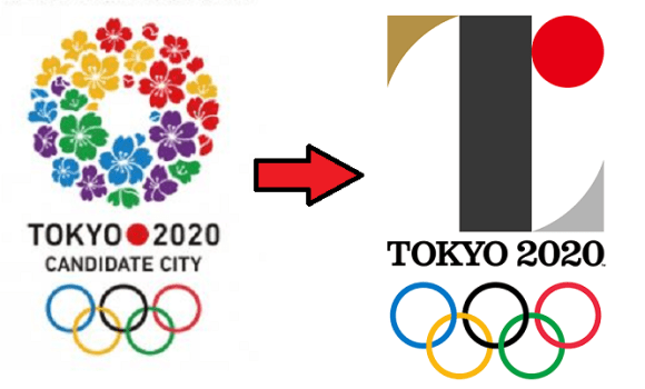
Back before Tokyo was selected as the host of the 2020 Olympics and Paralympics, the organizing committee started putting up posters around the capital touting its status as a candidate city. The logo was a circle of cherry blossoms using four of the five colors of the Olympic rings (with purple substituting for black).
You could say it was a clichéd choice, but on the other hand, it’d be hard to come up with a symbol more instantly associated with Japan than the sakura. Mt. Fuji, maybe, but it isn’t in Tokyo, and a piece of sushi would look more like a promotion for a restaurant than a sporting competition.
But perhaps because the cherry blossoms bloom in spring and Tokyo is hosting the Summer Games, the sakura ring isn’t going to be used for the actual 2020 Olympics and Paralympics themselves. Instead, Japan’s Olympic Committee recently came up with two new logos. In the eyes of some people in Japan, however, even though the designs embody a deep message, they’re lacking in aesthetic sense.
At first glance, it’s sort of hard to tell what the Olympic logo is trying to be. Why is there a gigantic “I” in the middle of a design for an event for which creating connections with other cultures is a key goal? Or is that supposed to be a lowercase “r,” with a two-tone red/black color scheme?

Actually, it’s a capital “T,” as in “Tokyo…”

…and also as in “team,” and “tomorrow,” which are being touted as themes for the Games in this video introducing the design.
The red circle is the same one that appears on the Japanese flag, representing the sun. The gold and silver accents are seemingly references for the Olympic medals of the same color (apparently there’s no room for third place in this logo).
But why black? Because that’s the shade you get after mixing every color together, the Olympic Committee says on its website.
There’s a similarly admirable sentiment behind the Paralympics logo.

Although it uses the same lines, the Paralympics’ symbol’s different colors result in a pair of black lines. Rotate them 90 degrees, and you get…

…an equal symbol, asserting the fundamental equality of all people.
Still, reactions have been mixed online in Japan.
“I can’t tell what they’re supposed to be!”
“I honestly like them.”
“In a word, they’re uncool.”
“I think they look good, because they’re sort of like a J-League soccer logo.”
“Doesn’t need the lame-looking part from the Japanese flag.”
“Should have gone with the one with the flowers.”
“All I’m seeing is the Zaku [one-eyed robot from Mobile Suit Gundam].”
Several commenters also expressed displeasure with how the red mark reminds them of the pickled plum in a cheap bento or rice ball, which is a common complaint among citizens of Japan regarding their country’s flag, as well.
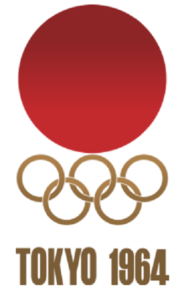
▼ It’s still a less prominent motif than it was in 1964, however.
We doubt anyone would argue against either of the design’s core philosophes, but from a purely visual standpoint, it looks like a lot of people were hoping for something that was meaningful while also being more overtly pleasing to the eye. Still, given some of the other things the Japanese Olympic Committee has to deal with right now, maybe logo design isn’t its top priority.
Source: Jin
Top image: The Tokyo Organising Committee of the Olympic and Paralympic Games (1, 2) (edited by RocketNews24)
Insert images: The Tokyo Organising Committee of the Olympic and Paralympic Games, YouTube/TOKYO Organising Committee, Wikipedia/Magnus Manske (edited by RocketNews24)
 Is there an adorably chubby bird hiding inside the Tokyo Olympics logo?
 Looks like it’s time to say good-bye, and maybe good riddance, to the 2020 Tokyo Olympics logo
 Tokyo Olympics opening ceremony preliminary ticket prices announced, wallets cry across Japan
 Tokyo Olympics and Paralympics mascot finalists unveiled【Pics & Video】
 McDonald’s new Happy Meals offer up cute and practical Sanrio lifestyle goods
 All-you-can-drink Starbucks and amazing views part of Tokyo’s new 170 meter-high sky lounge
 More foreign tourists than ever before in history visited Japan last month
 Is the new Shinkansen Train Desk ticket worth it?
 Beautiful Sailor Moon manhole cover coasters being given out for free by Tokyo tourist center
 Hamster abandoned at Tokyo ramen restaurant gets new home
 Disney princesses get official manga makeovers for Manga Princess Cafe opening in Tokyo
 Mister Donut ready to make hojicha dreams come true in latest collab with Kyoto tea merchant
 The oldest tunnel in Japan is believed to be haunted, and strange things happen when we go there
 The Top 5 Boys’ Love Manga in English on digital content library MangaPlaza goes beast mode
 We try out “Chan Ramen”, an underground type of ramen popular in the ramen community
 Starbucks reopens at Shibuya Scramble Crossing with new look and design concept
 Beautiful new Final Fantasy T-shirt collection on the way from Uniqlo【Photos】
 Foreign English teachers in Japan pick their favorite Japanese-language phrases【Survey】
 There’s a park inside Japan where you can also see Japan inside the park
 Japanese convenience store packs a whole bento into an onigiri rice ball
 Studio Ghibli releases Kiki’s Delivery Service chocolate cake pouches in Japan
 Japan’s bone-breaking and record-breaking roller coaster is permanently shutting down
 New definition of “Japanese whiskey” goes into effect to prevent fakes from fooling overseas buyers
 Foreign passenger shoves conductor on one of the last full runs for Japan’s Thunderbird train
 Our Japanese reporter visits Costco in the U.S., finds super American and very Japanese things
 Kyoto bans tourists from geisha alleys in Gion, with fines for those who don’t follow rules
 Studio Ghibli unveils Mother’s Day gift set that captures the love in My Neighbour Totoro
 Domino’s Japan now sells…pizza ears?
 New Japanese KitKat flavour stars Sanrio characters, including Hello Kitty
 Sales of Japan’s most convenient train ticket/shopping payment cards suspended indefinitely
 Sold-out Studio Ghibli desktop humidifiers are back so Totoro can help you through the dry season
 Japanese government to make first change to romanization spelling rules since the 1950s
 Ghibli founders Toshio Suzuki and Hayao Miyazaki contribute to Japanese whisky Totoro label design
 Doraemon found buried at sea as scene from 1993 anime becomes real life【Photos】
 Tokyo’s most famous Starbucks is closed
 One Piece characters’ nationalities revealed, but fans have mixed opinions
 We asked a Uniqlo employee what four things we should buy and their suggestions didn’t disappoint
 Princesses, fruits, and blacksmiths: Study reveals the 30 most unusual family names in Japan
 Studio Ghibli’s new desktop Howl’s Moving Castle will take your stationery on an adventure
 Tokyo Olympics to allow spectators, provided they “cheer quietly”
 Georgian Paralympic judo athlete arrested for attacking a security guard in a Tokyo hotel
 Tokyo train stations get new Olympic melodies and signage for the Games
 Online auction market booming for posters with cancelled, possibly copied 2020 Olympics emblem
 Tokyo Olympics bans fans from posting videos of the Games on their social media accounts
 Could the 2020 Tokyo Olympics logo possibly be plagiarized?
 Tokyo Olympics organizers offer to pay volunteers 125 yen 【US$1.13】 an hour, critics unimpressed
 JR East to introduce numbering system at all stations in Tokyo
 Japan ministry urges universities to adjust curriculum to accommodate student Olympic volunteers
 Harajuku Station will be demolished after the Tokyo Olympics and Paralympics
 Tokyo Olympics organizing committee president resigns over sexist remarks
 Governor of Tokyo unveils new city logo, internet responds with questions about plagiarism again
 Japan’s daruma dolls seem to be causing problems for horses at the Tokyo Olympics
 Tokyo Olympics will not allow spectators from overseas
 Japan’s Harajuku Station to be rebuilt ahead of 2020 Tokyo Olympics
Leave a Reply