
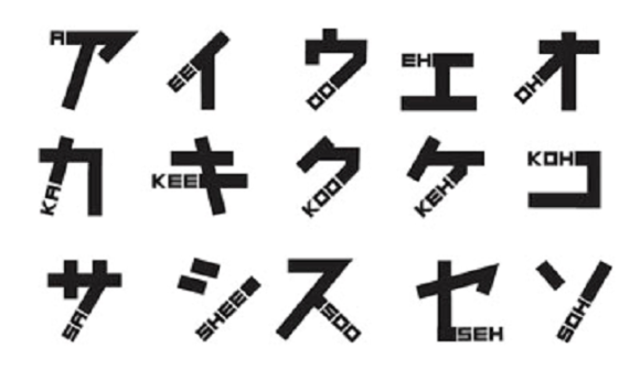
Written Japanese uses three kinds of script. At the top of the difficulty curve, you’ve got kanji, the complex characters originally imported from China that can require over a dozen brush strokes to write, with each kanji representing a word or concept.
A little less challenging are hiragana, a set of 50 curving phonetic characters, but if English is your native language, odds are you’ll have the least trouble with angular katakana. Like hiragana, katakana is a phonetic system, so each character corresponds to a syllable. Even better, while often one kanji can have three or four possible readings, each katakana has just one possible pronunciation.
Of course, you still have to memorize how to pronounce all 50 katakana (85 if you’re being really technical) in the first place. One group of graphic designers are aiming to make that task a little easier, though, with a font that combines katakana with phonetics written in English.
Employees of U.K.-design house Johnson Banks often come to Japan to work with clients. Japanese is a tricky language to learn, though, and even after multiple trips to the country, the business travelers weren’t going to just naturally pick up the ability to read katakana.
It’s not too surprising that professional designers are visually oriented people, and so Johnson Banks spent several months developing a new font where an English rendering of each katakana’s sound replaces a brush stroke in whole or part.
For example, here’s the name of Uniqlo, beloved outfitter of exchange students and Internet writers, as it looks in katakana.

And here it is rendered in Johnson Banks’ new Phonetikana font.

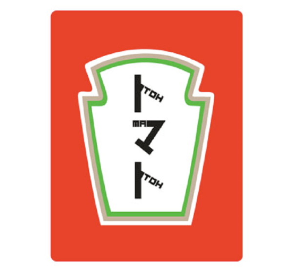
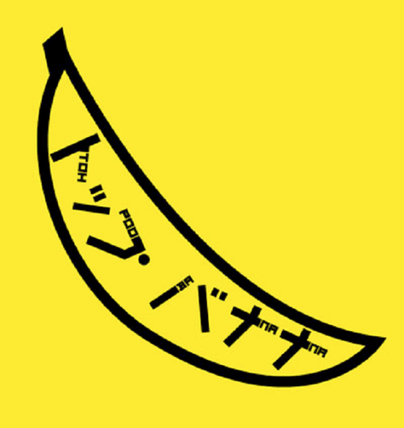
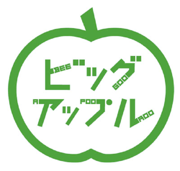
Katakana is primarily used for foreign loanwords, and we can see a few more artistic flourishes in these designs that the company drew up, possibly before lunch.
▼ tomato/tomato
▼ toppu banana/top banana
▼ biggu appuru/big apple
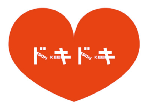
Aside from words of foreign origin, katakana is also often the go-to choice when writing sound effects, onomatopoeia, and comic book-style action words, such as doki doki, the sound of an excited heartbeat…
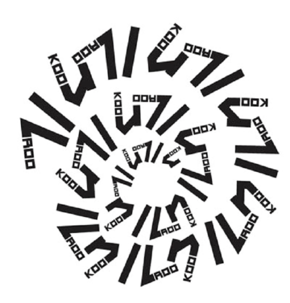
…kuru kuru, spinning or spiraling…
…or niko niko, indicating that someone is all smiles.
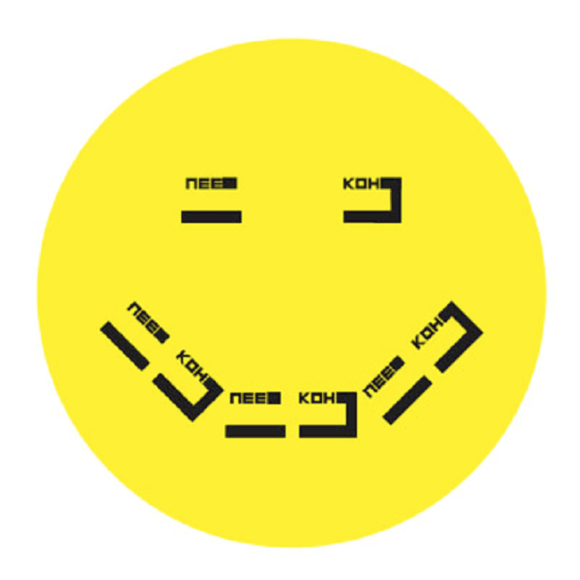
In a way, this linguistic mashup is a really clever idea, and with a few tweaks, it might actually be an easy way for brand new learners to dip their toes in Japan’s deep linguistic waters. What kind of tweaks? Well, let’s take another look at niko niko.
Notice how we’re spelling it differently than Johnson Banks does?
It’s true that there are a couple of different systems for writing Japanese words in the Latin alphabet, but there’s one method that’s by far the most common, and it says the Japanese syllable that sounds like the English word “knee” should be written “ni,” not “nee.” As a matter of fact, under the dominant system, “nee” would be pronounced like “neigh,” the sound a horse makes.
As a further example, let’s take a look at what happens to “sushi” in Phonetikana.

You end up with “sooshee,” which aside from looking weird, makes those two syllables seem a lot longer than they really should be. That’s a problem you’re a lot less likely to run into with the standard “sushi.”
Still, Johnson Banks says the font is a work in progress, and is looking for feedback from linguists. We’re wishing them good luck in ironing things out, and looking forward to Phonetikana Version Two.
Sources: Tabimedia, Johnson Banks
Images: Johnson Banks
 Yahoo! Japan finds most alphabetic and katakana words Japanese people want to find out about
 Pokémon Center apologizes for writing model Nicole Fujita’s name as Nicole Fujita
 Japanese elementary school student teaches us all how to pronounce English like a native speaker
 Foreigners in Japan vote for the best-looking katakana character
 Twitter users say Japanese Prime Minister’s name is hiding in the kanji for Japan’s new era name
 New Tokyo restaurant charges higher prices to foreign tourists than Japanese locals
 Tokyo’s famous Lost in Translation hotel is closed
 Japan’s wedding gift etiquette rule is too expensive, young people in survey say
 Studio Ghibli releases new mug and tumbler collection featuring Jiji and Totoro
 Tokyo sweets store sells beautiful soft serve ice creams that look like works of art
 Japanese hot spring inn lets you spend night for under US$1 if you do something special in return
 This is Japan’s, and the world’s, first capsule hotel, and you can still stay there
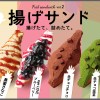 Fried sandwiches arrive in Tokyo, become hot topic on social media
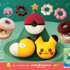 New Psyduck doughnut from Mister Donut’s Pokémon collection takes head-holding to new levels
 “Mt. Fuji convenience store” issues apology for bad tourist manners, adds multilingual signs
 How to make a secret rice bowl at Ichiran ramen
 FUK COFFEE?!? Japanese cafe has a perfectly innocent reason for its startling-looking name
 Japan has nearly 4 million abandoned homes, but where and why?
 Studio Ghibli unveils new goods that tip the hat to The Cat Returns
 McDonald’s Japan’s new pancake pie is a taste sensation
 McDonald’s new Happy Meals offer up cute and practical Sanrio lifestyle goods
 Foreigner’s request for help in Tokyo makes us sad for the state of society
 Japanese ramen restaurants under pressure from new yen banknotes
 All-you-can-drink Starbucks and amazing views part of Tokyo’s new 170 meter-high sky lounge
 Bad tourist manners at Mt Fuji Lawson photo spot prompts Japanese town to block view with screens
 More foreign tourists than ever before in history visited Japan last month
 Disney princesses get official manga makeovers for Manga Princess Cafe opening in Tokyo
 Sales of Japan’s most convenient train ticket/shopping payment cards suspended indefinitely
 Sold-out Studio Ghibli desktop humidifiers are back so Totoro can help you through the dry season
 Japanese government to make first change to romanization spelling rules since the 1950s
 Ghibli founders Toshio Suzuki and Hayao Miyazaki contribute to Japanese whisky Totoro label design
 Tokyo’s most famous Starbucks is closed
 Doraemon found buried at sea as scene from 1993 anime becomes real life【Photos】
 One Piece characters’ nationalities revealed, but fans have mixed opinions
 We asked a Uniqlo employee what four things we should buy and their suggestions didn’t disappoint
 Johnson Ting’s vision of the future is full of well-armed, gorgeously illustrated soldiers & cops
 Sushi store makes waves in Japan for meal with a surprising 14-character katakana name
 More cat stamps available so you can neko-fy all of your important life documents
 Fast & Furious’ Justin Lin to direct One Punch Man live-action, Twitter suggests potential cast
 TV audiences in Japan surprised to see “Pikachu,” “Raichu” as members of U.S. Olympic team
 Japanese first grader wins math contest by quantifying “which hiragana are the hardest to write”
 Keyboard app shares most common emoji by country, Japan’s are completely different from others
 A whole new batch of Pokémon can now be part of your legal signature in Japan with Gen III hanko
 Anime-style magic circles summon vocabulary for you in this language-learning app from Japan【Vid】
 Textbook gives Chinese otaku Japanese lessons with a side of anime girls and dialogue
 English conversation school in Japan has clever reminder that students don’t have to be perfect
 Donald Trump playing cards exist in Japan thanks to McDonald’s
 The awesome artwork hiding in the Japanese word processor: sakura, dragons, and sake
 BuzzFeed’s video of “anime expressions” delivers more laughs than useful language pointers
 The science behind why English speakers can’t pronounce the Japanese “fu”
Leave a Reply