
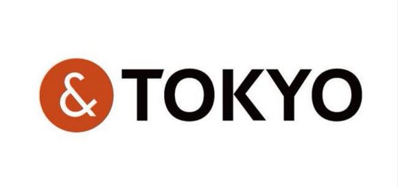
Tokyo Governor Yoichi Masuzoe revealed the capital city’s new logo at a press conference in the nation’s capital on Friday, and the simple design, featuring the one-line catchphrase “&TOKYO”, is already in the spotlight for all the wrong reasons.
The logo unveiling was met with a heightened level of scrutiny following the plagiarism scandal which resulted in the withdrawal of the official Tokyo 2020 Olympics logo recently, and it turns out that netizens are now worried about a recurrence of events. The distinctive white ampersand enclosed in a circle has been discovered online in a similar black, white and red configuration currently in use by another organisation, an insurance and commercial litigation company in New Zealand.
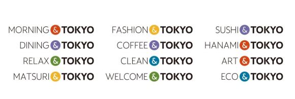
The new logo for Tokyo city was designed by ad agency Hakuhodo, under the guidance of Hakuhodo Design CEO Kazufumi Nagai, son of well-known graphic designer Kazumasa Nagai, at a cost of approximately 130 million yen (US$1.09 million). The logo is part of the Governor’s efforts to promote the nation’s capital overseas, with a number of additions to the “&TOKYO” phrase working to emphasise highlights of the city for visitors.

Netizens are concerned it might now be a case of “PLAGIARISM&TOKYO”, however, following the discovery of a similar-looking logo abroad, which, as luck would have it, is being used by a company of lawyers.

▼ To compound the problem, the distinctive ampersand is being used in a similar way by both organisations on their websites.

▼ The “&TOKYO” website features a variety of different colours, but the “&” mark still looks awfully similar.
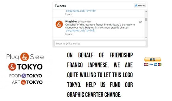
Surprisingly, this isn’t the first time the Tokyo logo has come under scrutiny, with French eyewear brand Plug&See using a similar red and white ampersand design. However, they have expressed full support, citing “the Japanese-French friendship”, for Tokyo to keep its design.
There’s been no word yet on a response from Jones & Co and at the moment it’s not known whether the company has any knowledge of the Tokyo logo. We’ll have to wait to see if New Zealand will follow suit with a similar peace branch, although admittedly, the law company logo does look markedly more similar than the one from Plug&See. Who knew a simple conjunction could cause such strife?
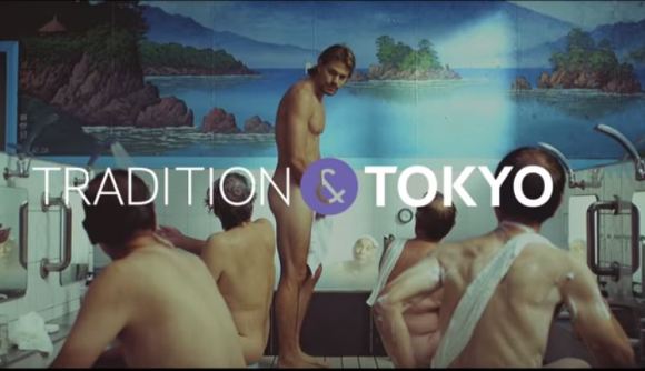
For a sneak peek at the campaign before official marketing begins on October 16, check out the three promotional videos below. Be sure to keep an eye out for a cameo from “Beat” Takeshi Kitano as a Japanese fishmonger and an appearance by artist Yayoi Kusama!
What do you think, Rocketeers? Are the people of Japan right to be concerned, or is everyone just on edge following the whole Tokyo Olympics logo debacle? After all, it’s just an ampersand in a circle…right?
Source: My Game News Flash
Top Image: &TOKYO
Insert Images: &TOKYO, Jones&Co, Plug&See, YouTube/TOKYOBRAND
 Looks like it’s time to say good-bye, and maybe good riddance, to the 2020 Tokyo Olympics logo
 Could the 2020 Tokyo Olympics logo possibly be plagiarized?
 Is there an adorably chubby bird hiding inside the Tokyo Olympics logo?
 Slot machine’s proposed logo suspiciously familiar to a classic video game
 Prefectural governor wants 2021 Olympics and torch relay cancelled, Tokyo not pleased
 Foreigner’s request for help in Tokyo makes us sad for the state of society
 Osaka governor suggests lowering voting age to 0 to curb population decline
 Suntory x Super Mario collaboration creates a clever way to transform into Mario【Videos】
 Japanese city loses residents’ personal data, which was on paper being transported on a windy day
 Akihabara pop-up shop sells goods made by Japanese prison inmates
 Harajuku Station’s beautiful old wooden building is set to return, with a new complex around it
 Ghibli Park now selling “Grilled Frogs” from food cart in Valley of Witches
 Tokyo Tsukiji fish market site to be redeveloped with 50,000-seat stadium, hotel, shopping center
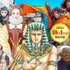 Historical figures get manga makeovers from artists of Spy x Family, My Hero Academia and more
 Japanese government to give all 18-and-under residents 100,000 yen… here’s why that’s bad news
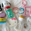 McDonald’s new Happy Meals offer up cute and practical Sanrio lifestyle goods
 Japanese ramen restaurants under pressure from new yen banknotes
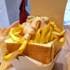 French Fries Bread in Tokyo’s Shibuya becomes a hit on social media
 Studio Ghibli releases new action figures featuring Nausicaä of the Valley of the Wind characters
 New private rooms on Tokaido Shinkansen change the way we travel from Tokyo to Kyoto
 Red light district sushi restaurant in Tokyo shows us just how wrong we were about it
 All-you-can-drink Starbucks and amazing views part of Tokyo’s new 170 meter-high sky lounge
 Beautiful Ghibli sealing wax kits let you create accessories and elegant letter decorations【Pics】
 Studio Ghibli releases Kiki’s Delivery Service chocolate cake pouches in Japan
 New definition of “Japanese whiskey” goes into effect to prevent fakes from fooling overseas buyers
 Our Japanese reporter visits Costco in the U.S., finds super American and very Japanese things
 Studio Ghibli unveils Mother’s Day gift set that captures the love in My Neighbour Totoro
 More foreign tourists than ever before in history visited Japan last month
 New Pokémon cakes let you eat your way through Pikachu and all the Eevee evolutions
 Sales of Japan’s most convenient train ticket/shopping payment cards suspended indefinitely
 Sold-out Studio Ghibli desktop humidifiers are back so Totoro can help you through the dry season
 Japanese government to make first change to romanization spelling rules since the 1950s
 Ghibli founders Toshio Suzuki and Hayao Miyazaki contribute to Japanese whisky Totoro label design
 Doraemon found buried at sea as scene from 1993 anime becomes real life【Photos】
 Tokyo’s most famous Starbucks is closed
 One Piece characters’ nationalities revealed, but fans have mixed opinions
 We asked a Uniqlo employee what four things we should buy and their suggestions didn’t disappoint
 Princesses, fruits, and blacksmiths: Study reveals the 30 most unusual family names in Japan
 FAILure to launch! Chinese apparel company, Uncle Martian, faces huge hurdles over its “new” logo
 Pokémon teams up with eyewear company JINS for 59 new stylish glasses for adults and kids
 Tokyo governor promotes silly Olympics umbrella hat, refuses to wear one herself
 Puma to release super limited-edition soccer cleats inspired by the Shibuya Scramble
 New Shinkansen bullet train design revealed for Nagasaki extension
 Take a ride on Japan’s luckiest tram in Setagaya
 Major Japanese ramen chain’s logo confuses Honda cars’ AI
 NBA team logos – Now with added Pokémon!
 16 tourist spots that China ripped off from the rest of the world
 New whisky Koeda chocolates from Morinaga: almost as strong as light beer, much more delicious
 Jack-‘o-lantern trash bags being handed out to fight litter during Tokyo Halloween parties
 A ‘Star Wars’-themed jet is flying across the world — here’s what it looks like inside
 Outdoor brand Logos teams up with Aichi sake brewery to make your camping more boozy
 Home-hunting in Japan changes as people eye new communities in wake of COVID-19
Leave a Reply