Could the clever designs also hold an undisclosed message?
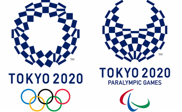
After all the controversy that was caused by the possibly plagiarized logos that were originally intended to be the emblems of the 2020 games, the recently announced new official designs haven’t run into any problems so far. The winning logo features an assortment of quadrilaterals arranged in a circular shape that is titled “Harmonized Checkered Emblem”. This design pulls its inspiration from Japanese history as the checkered pattern called ichimatsu moyo came about in the Edo period (1603-1867). The particular shade of blue is also a traditional color, one that stands for elegance and sophistication. According to the designer, Asao Tokolo, the variety of rectangles is meant to represent different countries, cultures, and ways of thinking.
As nice as all of that sounds, the logos are actually a lot cooler than you might think. Thanks to a bit of analysis, it’s clear that the two logos, the one for the Tokyo Olympic Games and the one for the Tokyo Paralympic Games, can actually morph into each other just by moving some of the rectangles around.
エンブレム、うちの教授が分析しとった。大きな24角形とその対角線から出来る12角形。それぞれの長方形はその12角形の頂点をお結んだもの。だと。見つけ出すのに3時間かかったって。 pic.twitter.com/K5RMV5vSlS
— ibuki (@ibuki7) April 26, 2016
枚数が同じどころじゃなかった。パーツごとの角度も変えないままオリンピックからパラリンピックにできる pic.twitter.com/TIv4IruvM8
— 鯵坂もっちょ🐟『つれづれなる数学日記』発売中 (@motcho_tw) April 26, 2016
Could it be that the message of “unity in diversity” in the Olympic games also extends to a unifying statement about the two events, how the athletes for the two games may be different, but that they both possess the same drive to become the best in their sport? As the two logos are made up of the exact same parts, but look a little different, so too do the athletes for both the Olympic and Paralympic games.
Even if that wasn’t the original intent of Tokolo, we can still hear the message loud and clear within his ingenious visual design. After the debacle of the original logos, these designs are definitely ones that we can get behind.
Sources: My Game News Flash, Tokyo 2020
Images: Tokyo 2020

 Could the 2020 Tokyo Olympics logo possibly be plagiarized?
 Is there an adorably chubby bird hiding inside the Tokyo Olympics logo?
 Looks like it’s time to say good-bye, and maybe good riddance, to the 2020 Tokyo Olympics logo
 The 2020 Tokyo Olympics announces the winner of its adorable mascot election
 Tokyo Olympics opening ceremony preliminary ticket prices announced, wallets cry across Japan
 Bad tourist manners at Mt Fuji Lawson photo spot prompts Japanese town to block view with screens
 Icon’s Mac & Cheese Burger contender for best burger in Tokyo【Taste test】
 Two things to do, and two things not to do, when leaving a traditional Japanese inn
 Orange Juice Crisis ’24 – Japan’s OJ supplies drying up
 McDonald’s Japan’s new pancake pie is a taste sensation
 FUK COFFEE?!? Japanese cafe has a perfectly innocent reason for its startling-looking name
 Studio Ghibli unveils massive T-shirt collection featuring top anime movie characters
 Red light district sushi restaurant in Tokyo shows us just how wrong we were about it
 Station in China reminds us to kindly “wait outside a noodle”
 Ancient temple with National Treasures is a hidden gem on the Nara Yamato Four-Temple Pilgrimage
 Foreigner’s request for help in Tokyo makes us sad for the state of society
 Japanese city loses residents’ personal data, which was on paper being transported on a windy day
 One of Japan’s oldest castles now lets travelers spend night on the grounds, drink in its keep
 Ghibli Park now selling “Grilled Frogs” from food cart in Valley of Witches
 Studio Ghibli unveils new goods that tip the hat to The Cat Returns
 McDonald’s new Happy Meals offer up cute and practical Sanrio lifestyle goods
 New definition of “Japanese whiskey” goes into effect to prevent fakes from fooling overseas buyers
 Our Japanese reporter visits Costco in the U.S., finds super American and very Japanese things
 Japanese ramen restaurants under pressure from new yen banknotes
 All-you-can-drink Starbucks and amazing views part of Tokyo’s new 170 meter-high sky lounge
 More foreign tourists than ever before in history visited Japan last month
 New Pokémon cakes let you eat your way through Pikachu and all the Eevee evolutions
 Disney princesses get official manga makeovers for Manga Princess Cafe opening in Tokyo
 Sales of Japan’s most convenient train ticket/shopping payment cards suspended indefinitely
 Sold-out Studio Ghibli desktop humidifiers are back so Totoro can help you through the dry season
 Japanese government to make first change to romanization spelling rules since the 1950s
 Ghibli founders Toshio Suzuki and Hayao Miyazaki contribute to Japanese whisky Totoro label design
 Doraemon found buried at sea as scene from 1993 anime becomes real life【Photos】
 Tokyo’s most famous Starbucks is closed
 One Piece characters’ nationalities revealed, but fans have mixed opinions
 We asked a Uniqlo employee what four things we should buy and their suggestions didn’t disappoint
 Tokyo Olympics and Paralympics mascot finalists unveiled【Pics & Video】
 Governor of Tokyo unveils new city logo, internet responds with questions about plagiarism again
 Online auction market booming for posters with cancelled, possibly copied 2020 Olympics emblem
 Georgian Paralympic judo athlete arrested for attacking a security guard in a Tokyo hotel
 Tokyo train stations get new Olympic melodies and signage for the Games
 Tokyo Olympics to allow spectators, provided they “cheer quietly”
 Heatstroke countermeasures already being prepped for 2020 Olympics
 Japanese Internet reacts in dismay to official Olympics Twitter quietly changing its header
 Japan’s Harajuku Station to be rebuilt ahead of 2020 Tokyo Olympics
 Tokyo Olympics bans fans from posting videos of the Games on their social media accounts
 Seiji gets into the Olympic spirit on the cheap at 100-yen store Daiso
 Half of Tokyo’s universities to use credits to “convince” students to volunteer in 2020 Olympics
 Japan government asking for our old electronics so scrap metal can be used in Olympic medals
 Japan unveils beautiful new yen coins for Tokyo Olympics, needs your help picking the best design
 Man in charge of cybersecurity for 2020 Olympics has never touched a computer
 Japanese athlete caught after slipping steroids into rival’s drink to further Olympic ambitions
Leave a Reply